Evergreen Brand World
CLIENTMolton Brown
Rebuilding Molton Brown's evergreen asset library into a cohesive editorial still-life system — tactile, considered and scalable across every channel and category.
ROLEConcept & Campaign Development, Art Direction & World Building, Creative Team & On Shoot Leadership, Brand Evolution
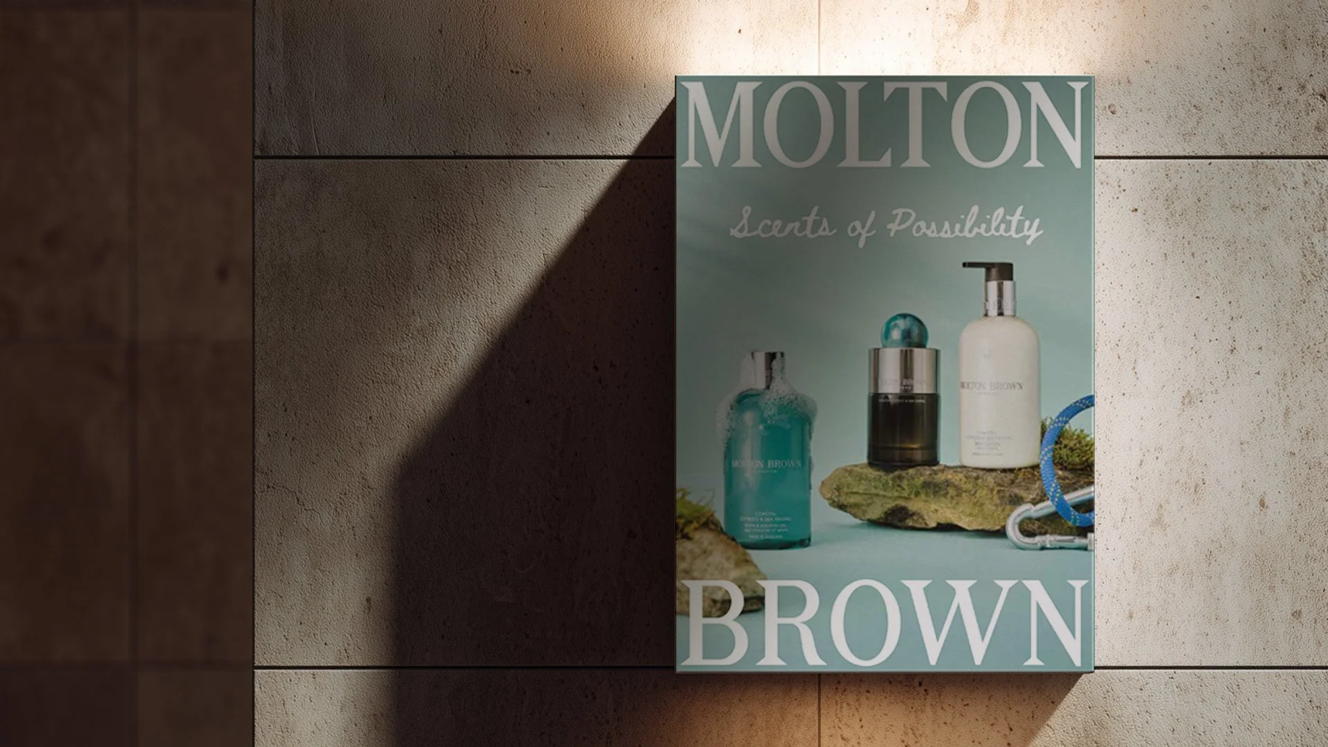
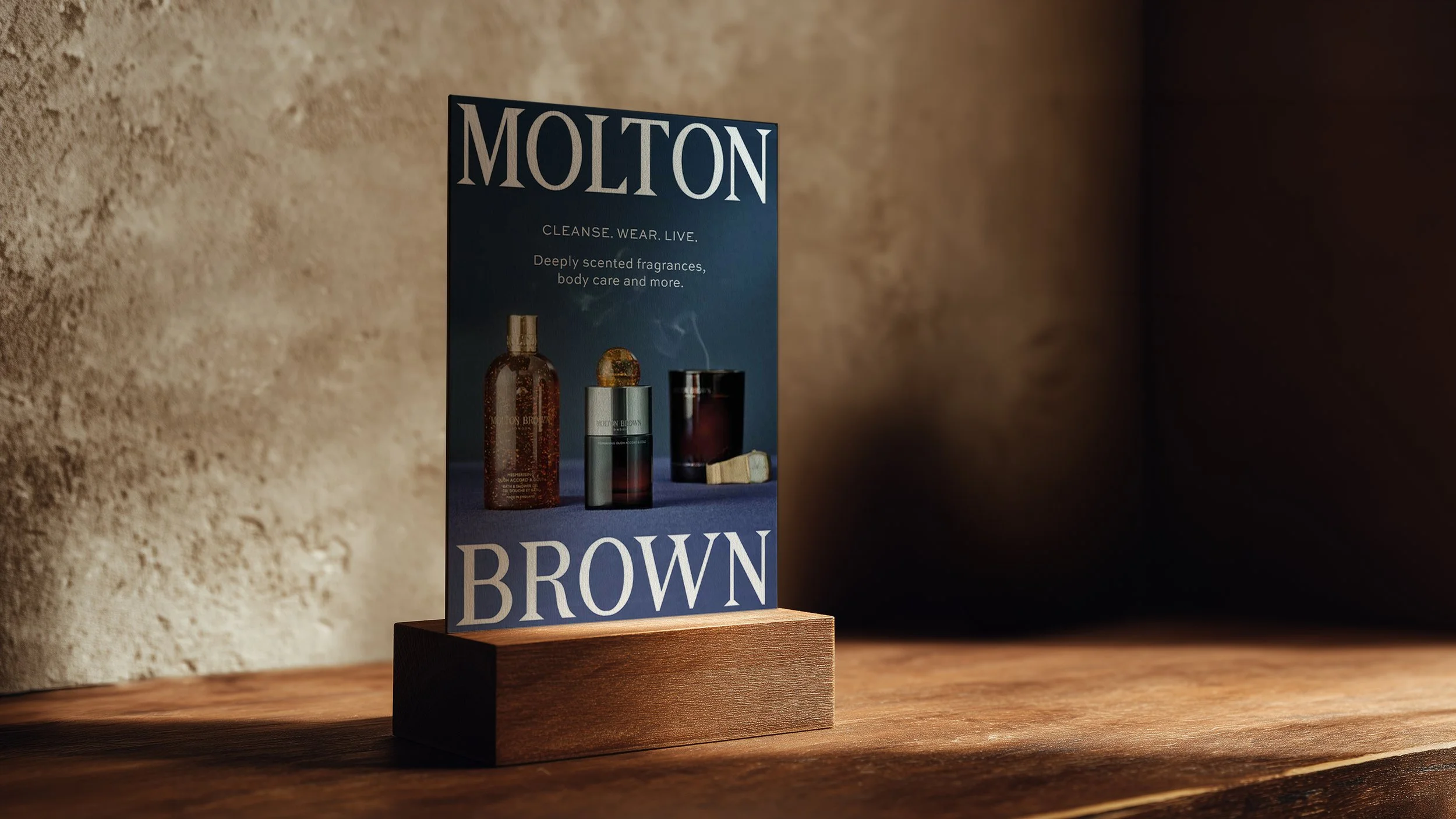
WHERE IT WAS FEATUREDGlobal · Social · E-Commerce · CRM · Third Party Partners · Retail · Concessions
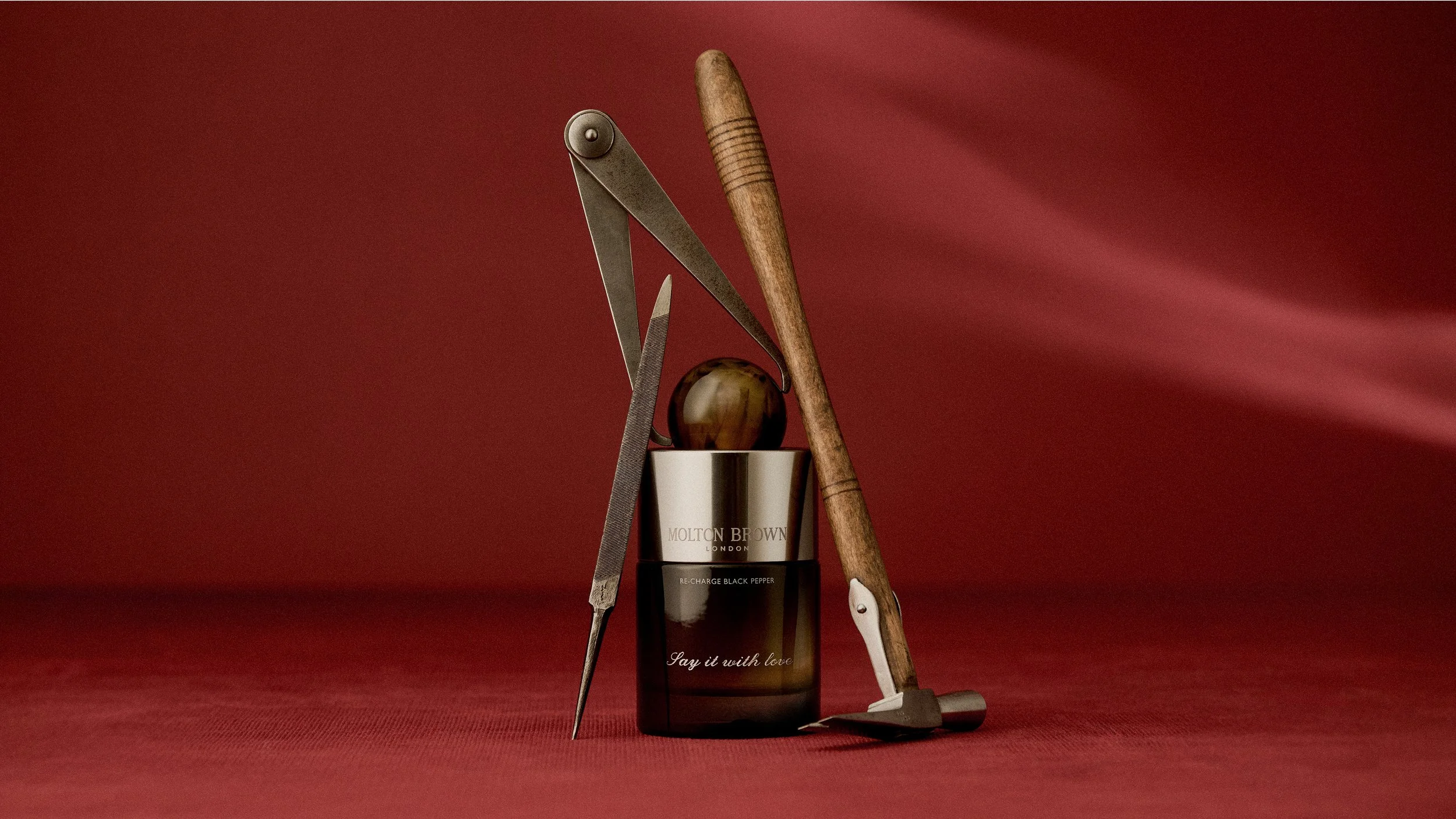
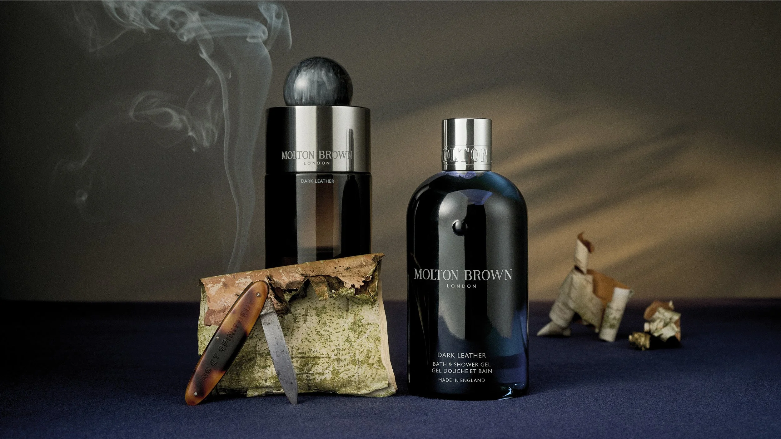
DELIVERABLESStills
Challenge
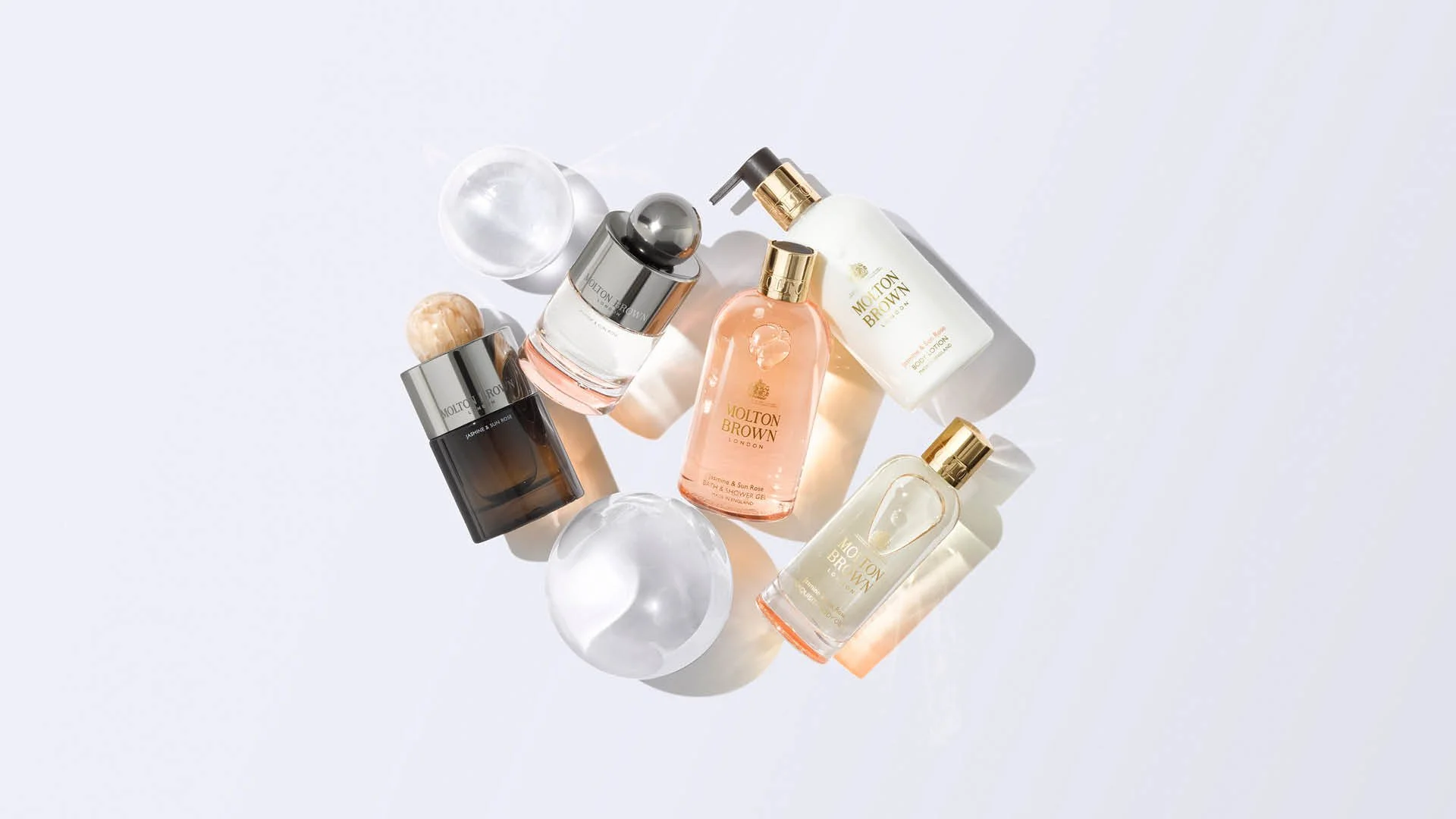
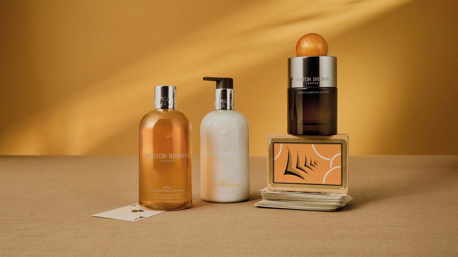
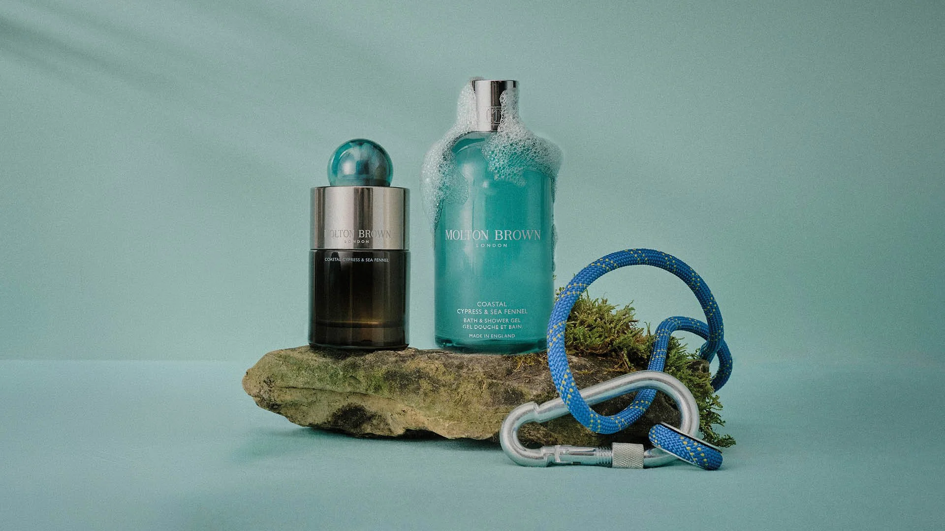
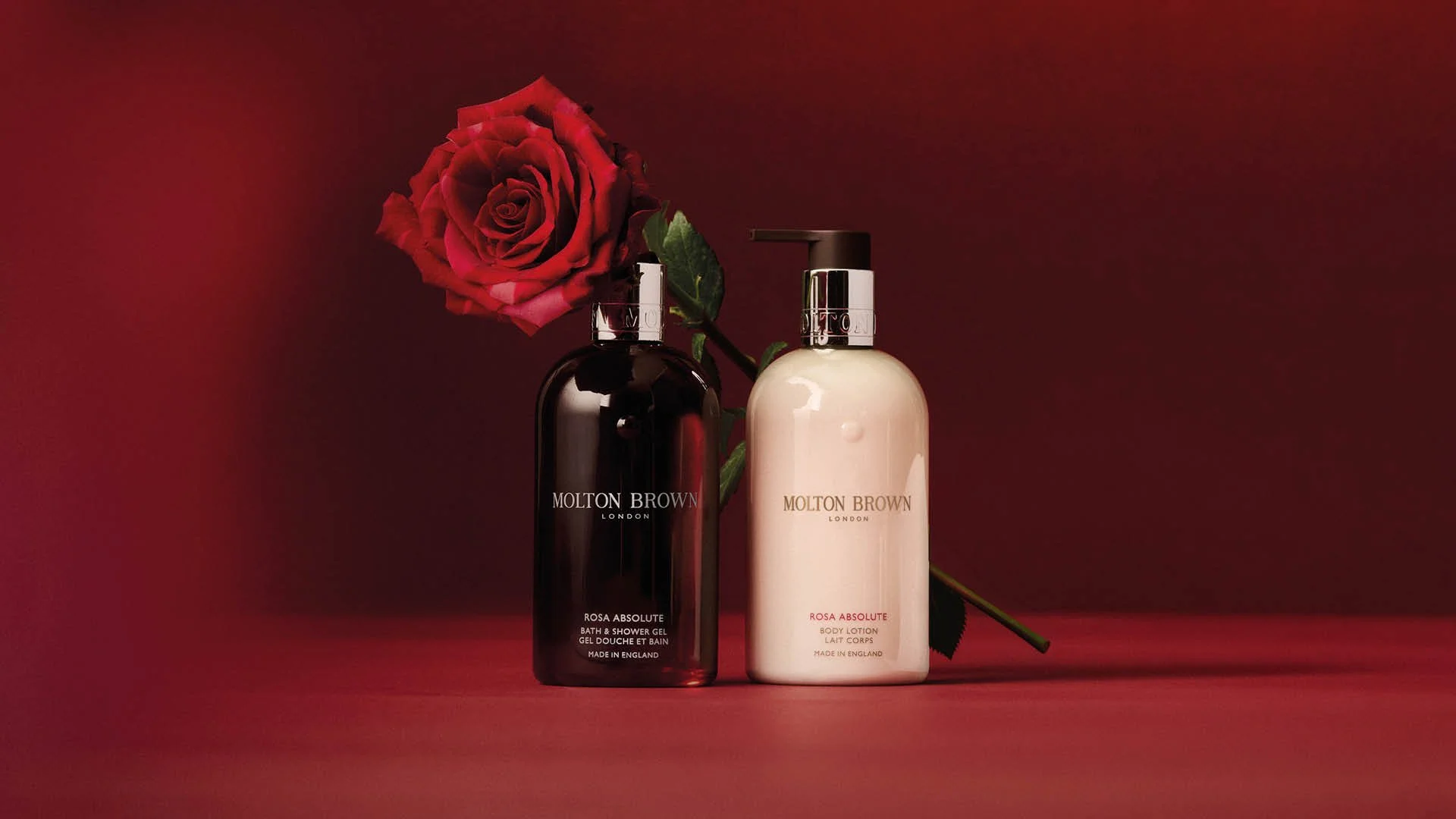
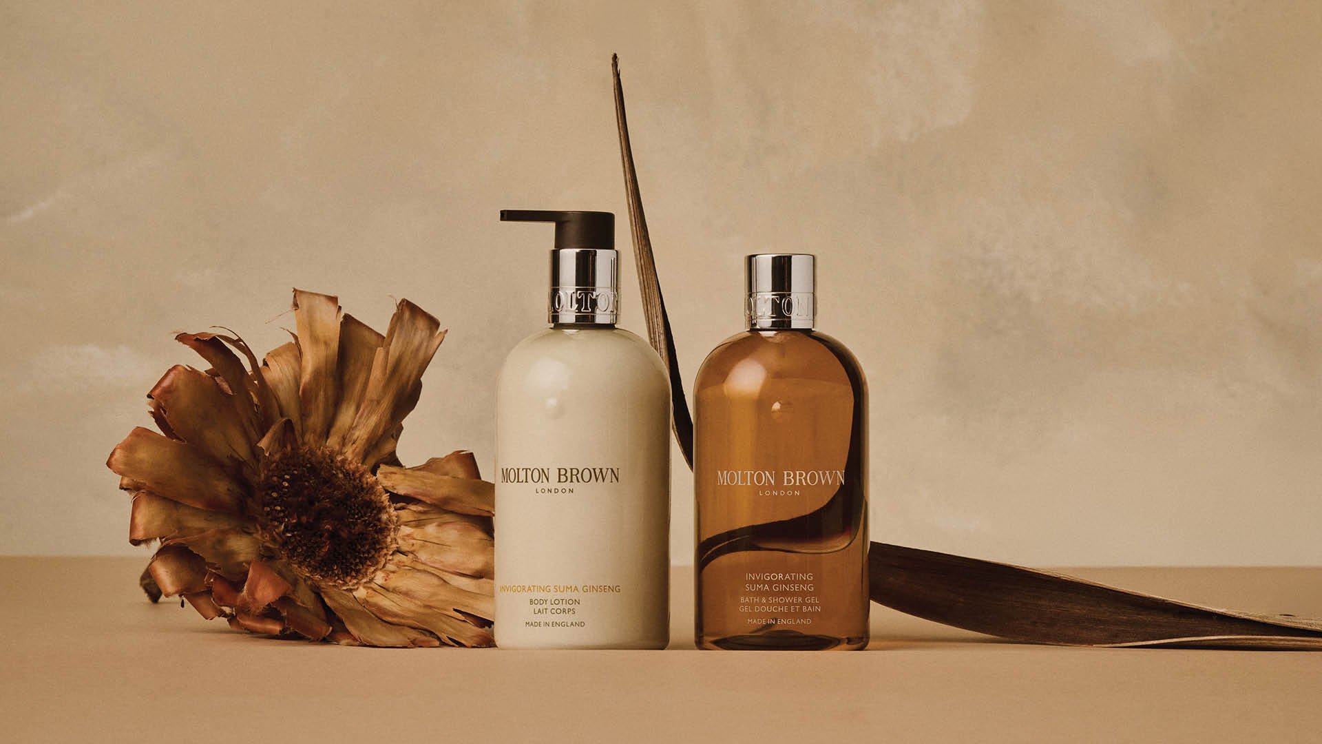
The existing evergreen asset library felt inconsistent across categories and channels — leaning heavily on brown and white, and often reading as functional packshots rather than a distinct brand world. The task was to inject colour and craft into the imagery, creating a scalable visual system that could flex across fragrance collections, categories, gifting and services, and work globally across multiple touchpoints while remaining unmistakably Molton Brown.

Creative Approach
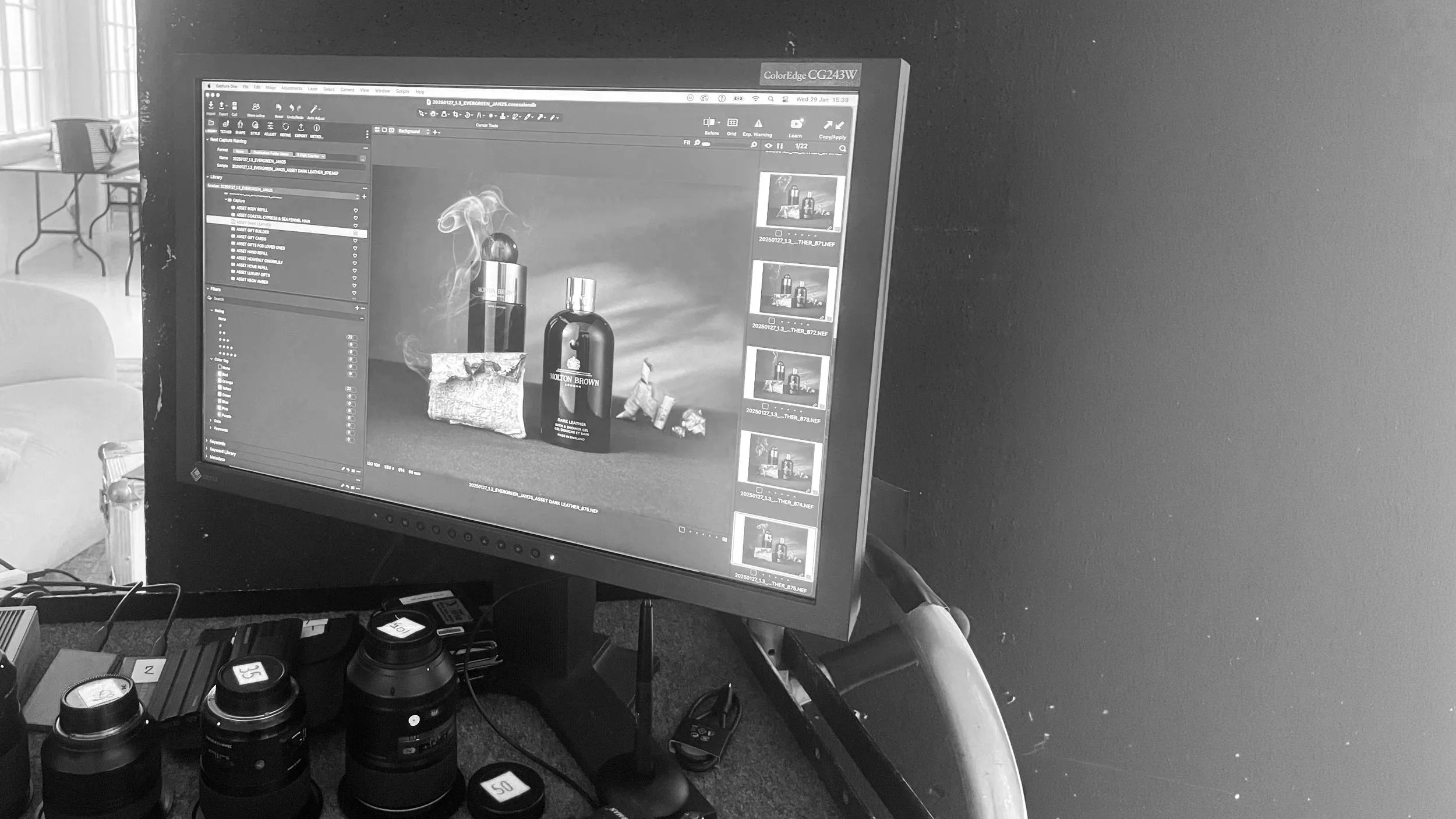
Rather than creating standalone images, I built a modular photographic system designed to roll out consistently while still allowing variation across collections and categories.
System Thinking
Established a set of creative principles to unify the evergreen library across fragrance collections, categories, gifting and services.
Built a repeatable structure for composition, styling and background selection to maintain coherence at scale without the work feeling repetitive.
Colour & Set Logic
Developed a colourway framework to balance the full library when assets sit together across e-commerce, email and retail.
Ensured backgrounds supported product contrast and category clarity, while remaining sympathetic to each scent's mood and olfactive cues.
Storytelling Through Styling
Designed layered sets using texture, material and light to add depth without visual clutter.
Introduced a sense of "human pulse" through subtle imperfection, used product and lived-in positioning — so the world felt real rather than sterile.
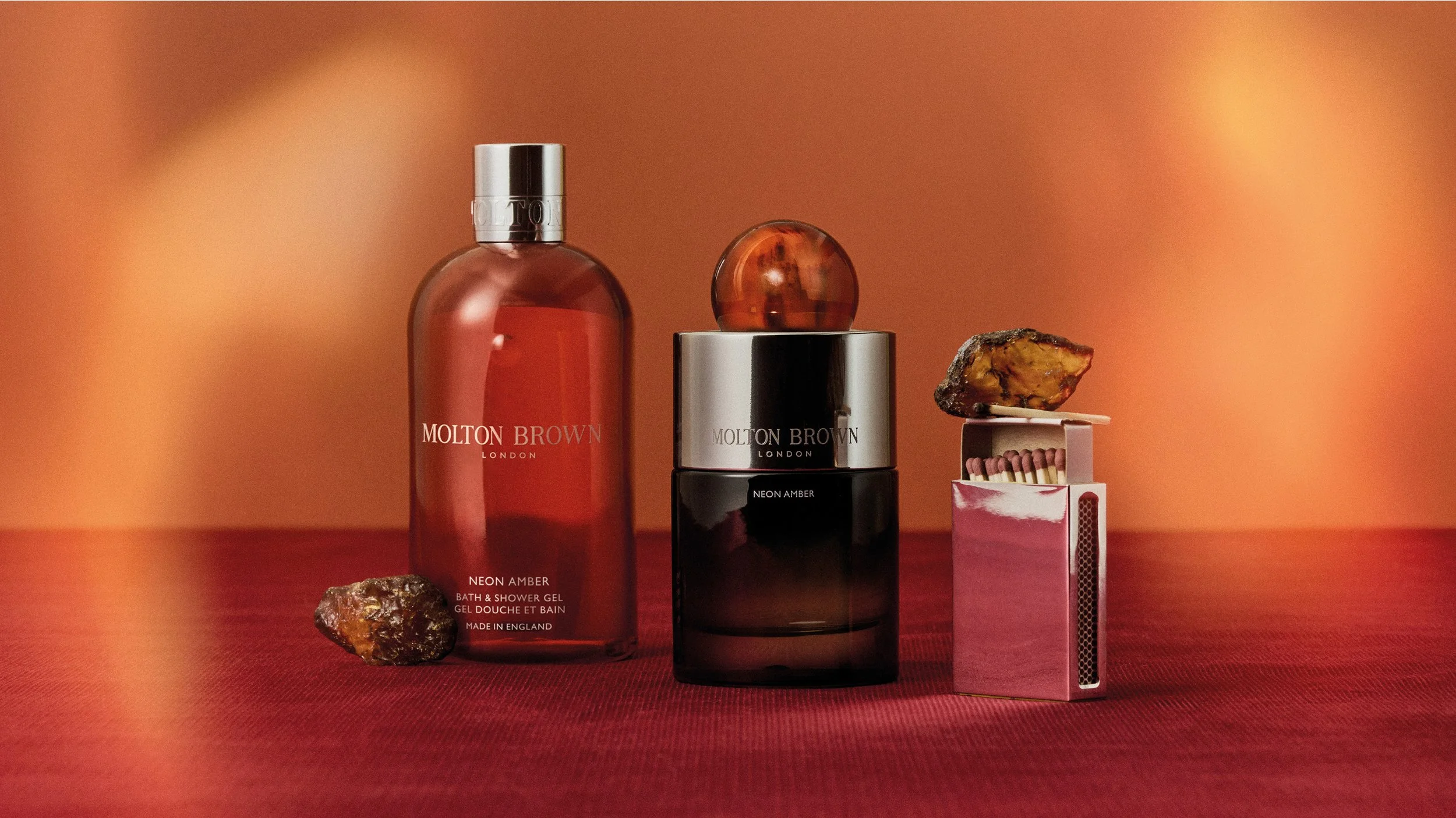
Neon Amber Collection AFTER
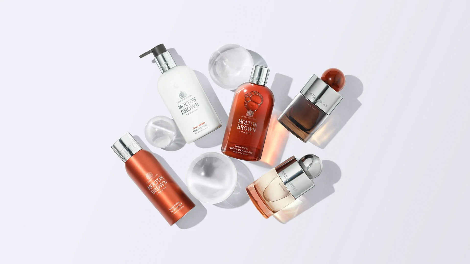
Neon Amber Collection BEFORE
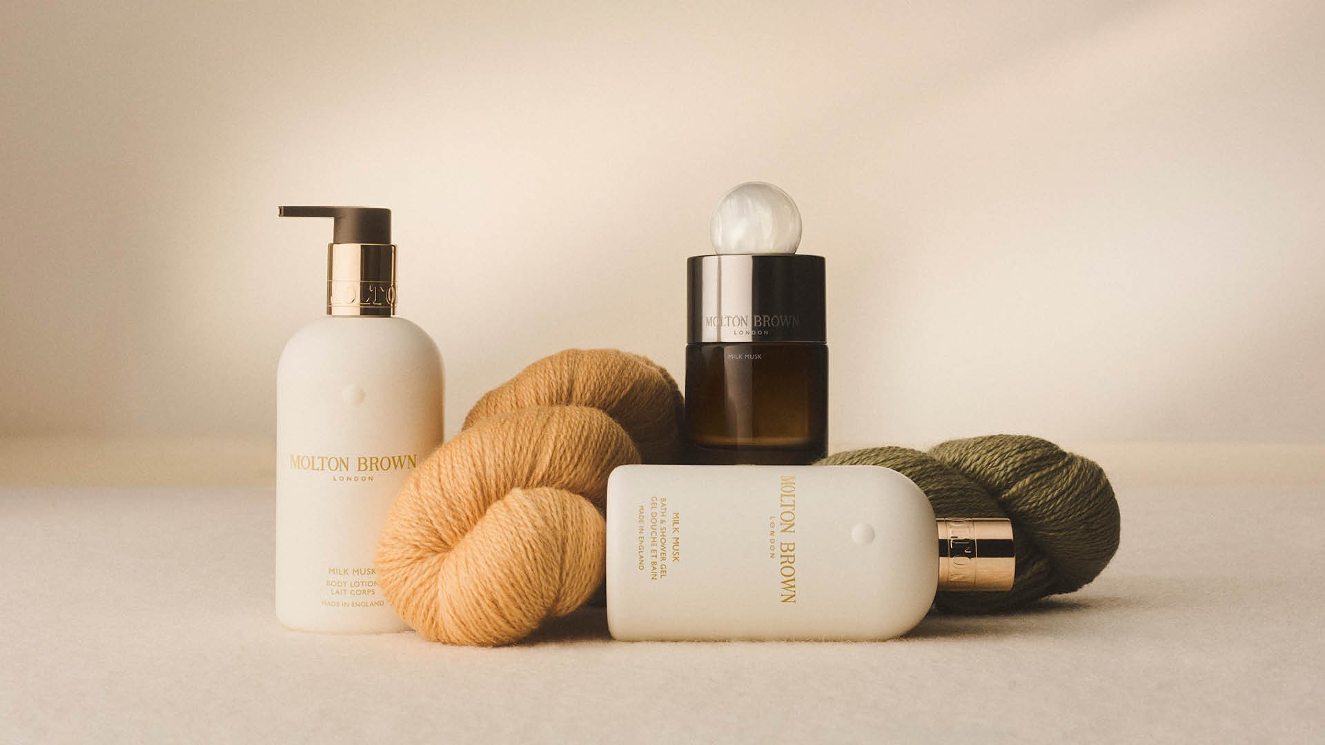
Milk Musk AFTER
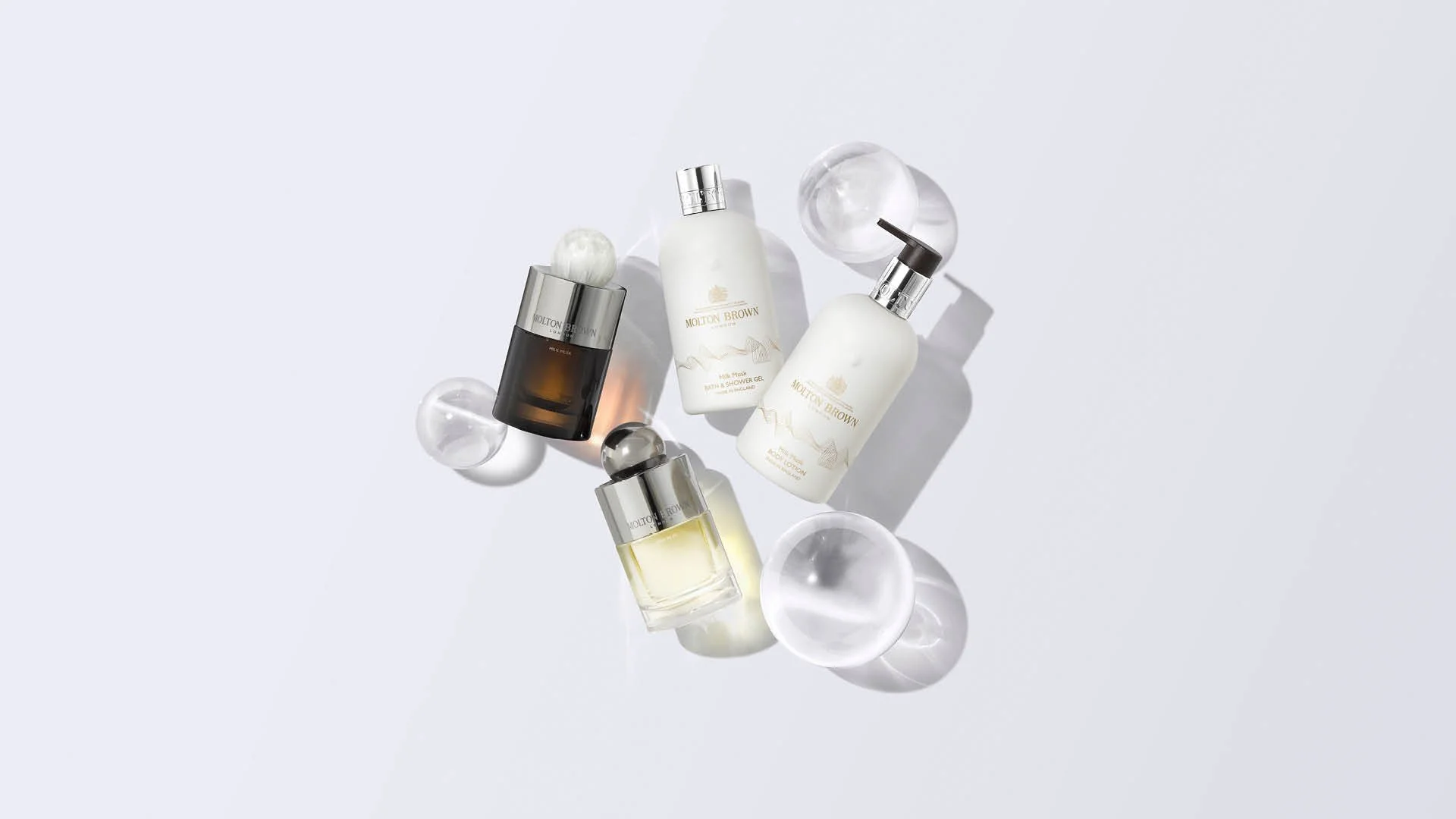
Milk Musk BEFORE

Jasmine & Sunrose AFTER
Jasmine & Sunrose BEFORE


Impact
The project replaced an inconsistent, category-by-category approach with a single unified visual language — one that could flex across Molton Brown's full product range without requiring individual art direction for every asset.
The new system was adopted globally across e-commerce, social, CRM, retail and concessions, significantly reducing production complexity while improving visual consistency across channels. The before-and-after shifts across collections demonstrate how far the brand world moved — from flat, functional imagery to a tactile, editorial standard that better reflected Molton Brown's positioning.

Rollout

Social · Ecommerce · CRM
Retail · Concessions